
Recently, I have been contributing to an open source, experimental data visualization project called Pancake. Pancake was created by Rich Harris, New York Times Graphic Editor and Creator of Svelte. (If you haven't heard of Svelte, check out my initial post on Svelte last fall). Below is a bit about the project, but if you came for the data viz and not so much the javascript, you can skip straight to Slope Graph section.
Pancake
Pancake is an extension of the work Rich has done with Sapper, a Svelte static site framework allowing developers the ability to create server rendered (aka super fast) web apps with ease. You can read all about the benefits of SSR here—essentially it allows node to serve "compiled" html files immediately, eliminating the lag time of the browser downloading the JavaScript.This fits perfectly with the Svelte model of "compiling away" to optimized vanilla JavaScript. Less code. Faster Apps. Pancake was created as a tool to create server rendered (sans javascript ) data visualizations with Svelte. Traditionally, JavaScript and libraries like D3 are used to manipulate the DOM to "draw" our charts client side. Pancake provides a bundle of Svelte Components that wrap elements of a chart to create dyanamic server rendered visualizations. Check out this article where Rich explains goes into more and showd some examples of how it works.
What are Slope Graphs?
Slope Graphs are often referred to as Tufte Graphs for the statistician and patron saint of data viz and information design. Edward Tufte introduced this chart in his book The Visual Display of Quantitative Information(side note: if you are into data div and information design and you haven't read this , I highly, highly recommend it).
A great way to think about slope graphs are to imagine you are looking at a super zoomed in version of a line chart. In a slope graph, multiple actors are positioned using an ordinal or interval scales on the left and right side data points and labels. A line connects the two points to form a slope. For instance, if a line graph charts a subject's income for every month of the year, in this paradigm we would examine how all values changed but only over one month. Here's an example:
In Tufte's work, he often assesses the quality of a chart based on a metric he refers to as "data ink" — the ratio of "drawing" needed to convey the appropriate meaning. Charts with higher "data ink" are usually confusing and a sign that a different models would communicate the data more clearly. The slope graph is an elegant in this respect. This might make one think that it would be a common chart to see in the wild. So why aren't slope graphs more common?
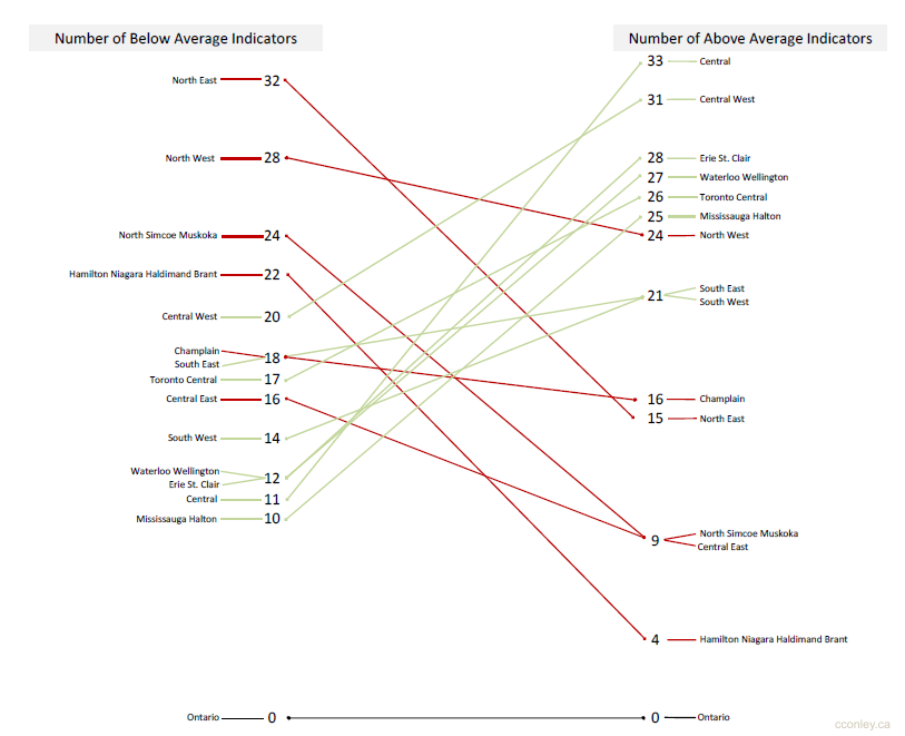
Designing these visualizations can be tricky. Simply scaling labels hierarchically could cause some labels to bunch together and overlap. Assuming code is used to build the chart programmatically, some care must be taken in dealing with these label collisions to optimize both legibility and accuracy. Below is the example I contributed the Pancake repo of examples. It is based on a this chart made by Hamilton Ulmer
The Chart
My solution was to roll my own label collision algorithm. At first I tried tweaking existing functions, but I then realized the amount of customization for purposes was beyond the scope of the project. Below are the basic steps I took to deal with label collision:
- Each side is searched for an overlap.
- If an overlap is found, check if there is space above and below to shift the items to create enough space.
- If there is enough space, shift the items. Else, add value to a a cluster array in order to render to a bumped out legend.
You can see the live version and experiment with the code with the Svelte REPL here.
I learned a ton of great information about slope graphs from Charlie Park's posts from a few years ago. You can check those out here
